10款優秀的移動設備測試工具(英文)
10款優秀的移動設備測試工具
With the ever-increasing sales of smartphones and the burgeoning tablet market starting to skyrocket, coupled with far greater aclearcase/" target="_blank" >ccess to more robust mobile data networks, the internet is now being accessed by our users in a multitude of new ways.
The huge range of mobile devices used to browse the web now means you really have to consider making your site mobile-compatible.
But how do you go about it? Testing your site on mobile devices can be time-consuming and expensive due to the vast number of different mobile devices.
Fear not, because there are some handy tools available at your disposal for making sure that your website renders appropriately on the Mobile Web. This article shares and discusses 10 such tools.
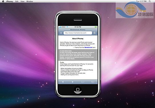
1. iPhoney

An excellent free iPhone tester, iPhoney isn’t exactly an emulator, but allows developers to create 320x480px websites for use on the iPhone. It allows you to test images and code in a pixel-perfect Apple-Safari-powered environment, with all the normal features including Portrait and Landscape modes, fullscreen, zoom and plugins.
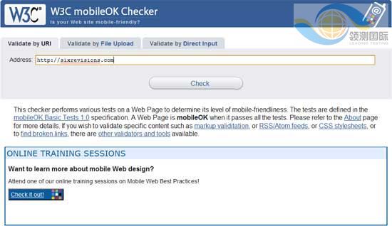
2. W3C mobileOK Checker

This checker is a web-based automated validation tool that checks to see how mobile-device-friendly your website is. The tests are checked against the W3C mobileOK Basic Tests specification developed by W3C.
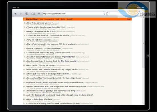
3. iPad Peek

This handy web-based tool allows you to see how your websites look when rendered on the iPad. It’s recommended that you use a WebKit-based browser such as Apple Safari or Google Chrome to have as accurate a simulation as possible — or at the very least, a CSS3-capable browser that supports transformation properties (like Opera) because it uses them to render the page in Portrait mode.
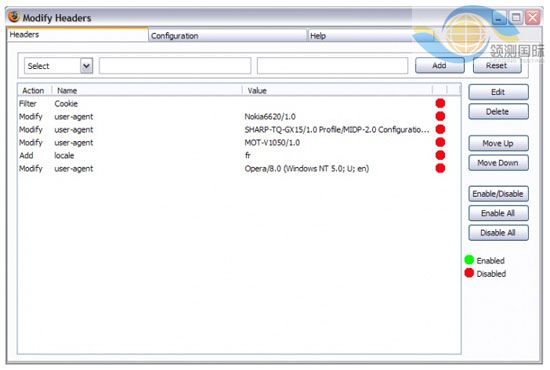
4. Modify Headers Add-on for Firefox

There are add-ons for Firefox that can manipulate the data sent to servers to make it seem as if the user agent is browsing on a mobile device, even when they’re not. To do this, you need an add-on called Modify Headers (for Firefox).


